
07 — Key Screens
Every screen has a job.
Six surfaces, one system. Each screen is shown with the decision behind it — what it does, why it was designed that way, and how it is intended to help the user.
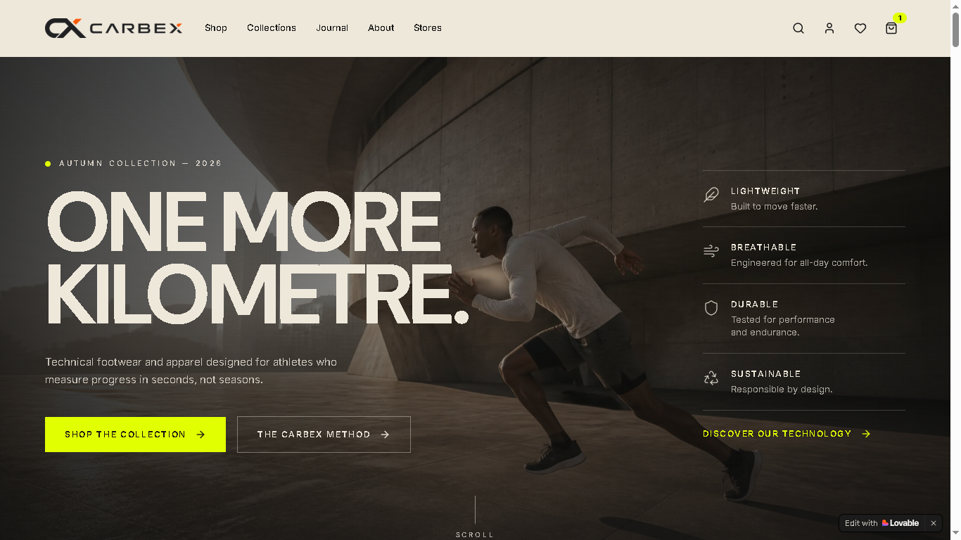
01
Homepage
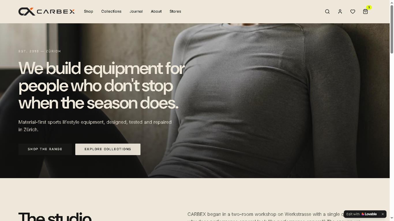
- What
- A single-message hero with performance callouts and multiple entry points into shop, collections and editorial.
- Why
- Give the visitor a reason and a context before a price, so the brand is understood before the catalogue opens.
- UX benefit
- Users orient in seconds and choose the path that matches their intent.
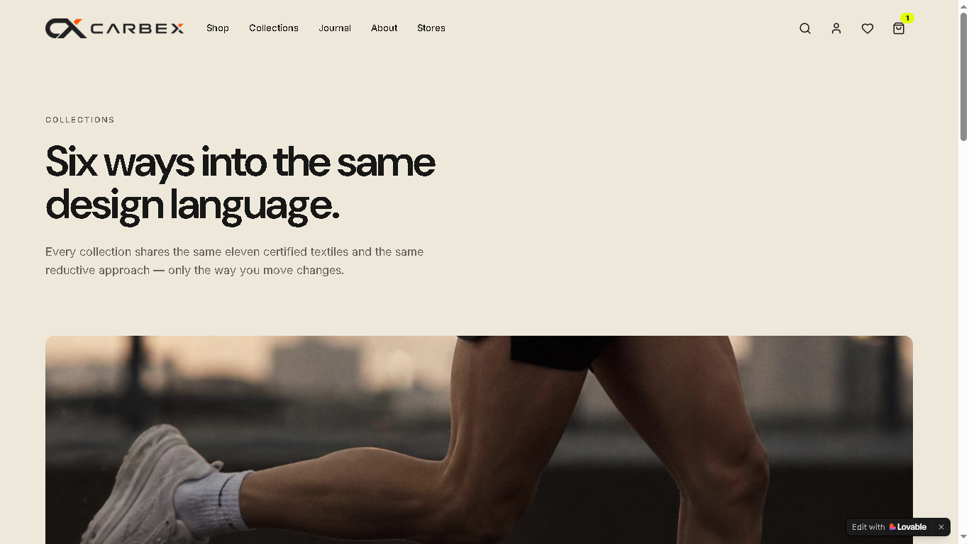
02
Collections
- What
- Six collections presented as visual categories inside one shared design language.
- Why
- Turn navigation into exploration instead of a dropdown of labels.
- UX benefit
- Fewer navigation decisions and a clearer mental model of the range.
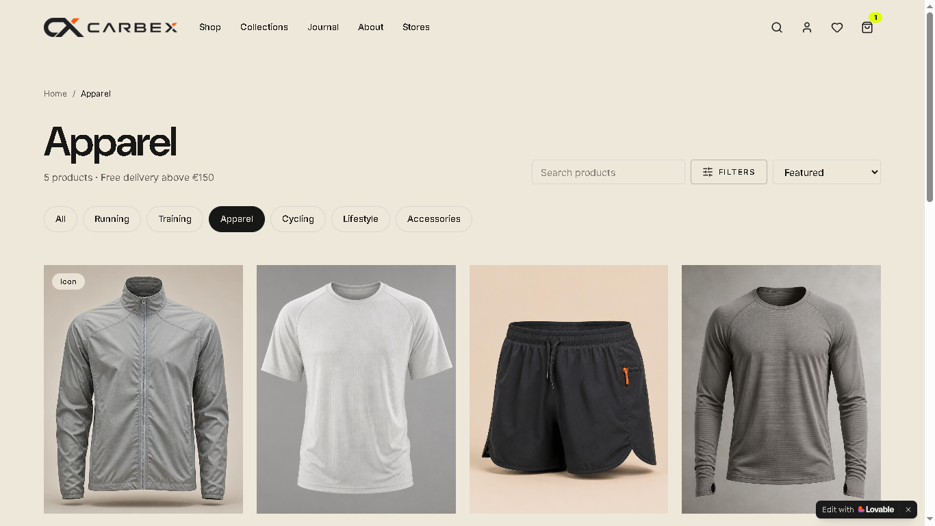
03
Shop — product discovery
- What
- A structured shopping experience that helps users explore products through clear categories and visual hierarchy.
- Why
- Reduce cognitive overload and make product exploration feel more intuitive.
- UX benefit
- Clear hierarchy helps users understand and compare products faster.
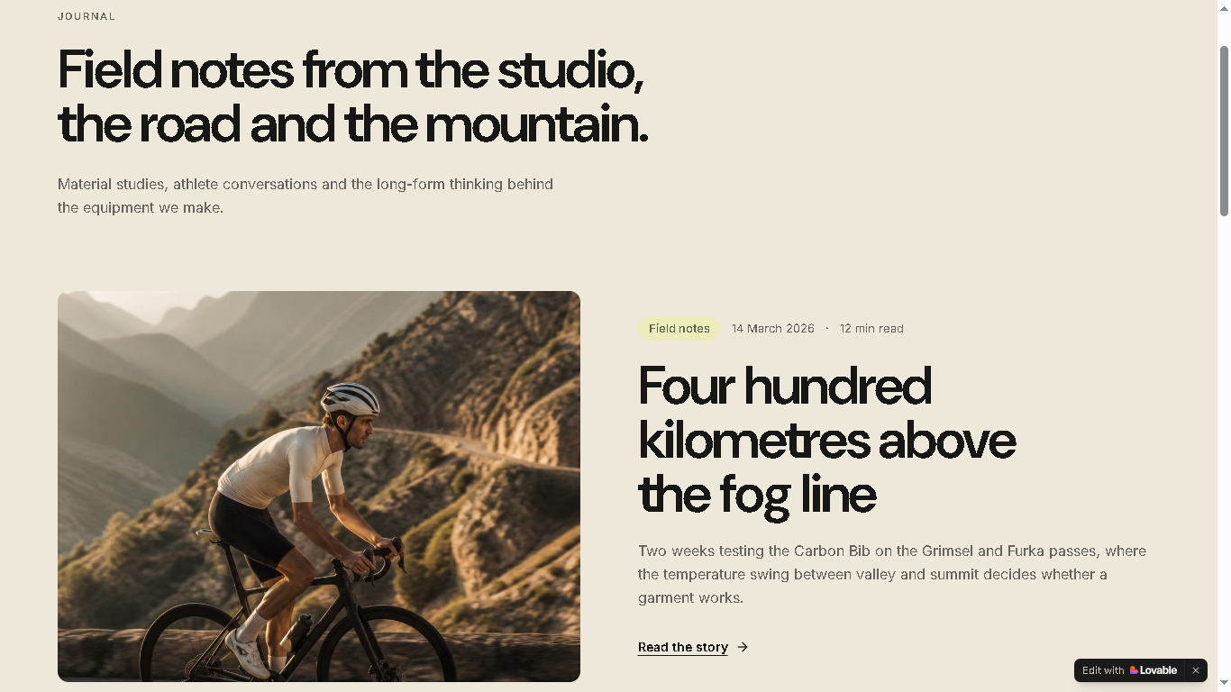
04
Journal
- What
- Long-form field notes built on the same grid as the shop, linking stories back to products.
- Why
- Keep storytelling inside the commerce experience rather than in a separate destination.
- UX benefit
- Context builds confidence at the moment a user is still deciding.
05
About
- What
- A statement-led page explaining the design philosophy and material approach.
- Why
- A performance brand has to answer 'why should I trust this' before 'how much'.
- UX benefit
- Brand understanding lowers hesitation later in the journey.
06
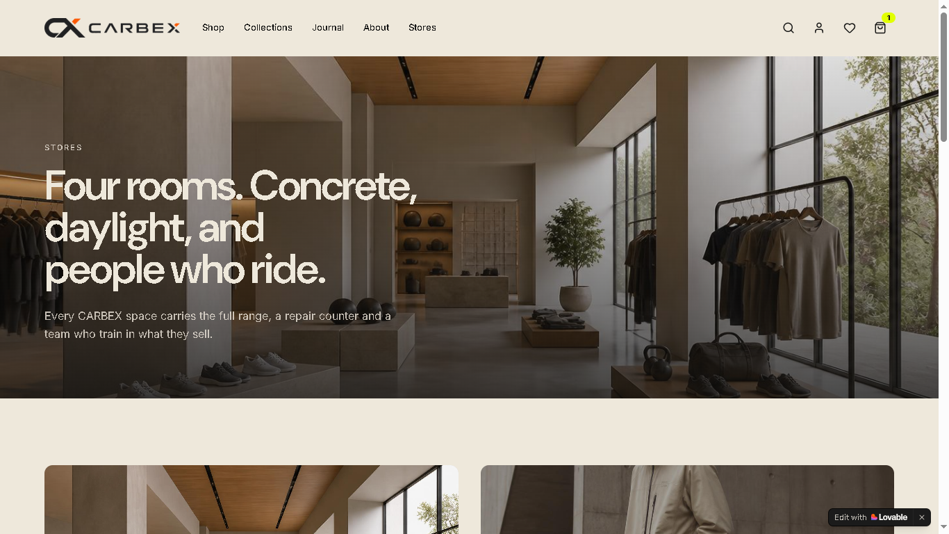
Stores
- What
- Physical retail locations shown with the same editorial photography and typographic system.
- Why
- Connect the digital experience to a real-world touchpoint without switching visual language.
- UX benefit
- One continuous brand experience across channels.